
.svg)


The home of design thinking
Dive in and leave with a mastery of desirability, feasibility, and viability.
What is design thinking?
Design thinking is a human-centered approach to solving complex problems. It integrates the needs of people, the possibilities of technology, and the requirements for business success to generate innovative solutions.
At its core, design thinking brings together three things:
What’s desirable for people
What’s viable for organizations
What’s feasible with technology
At its core, design thinking brings together three things:
What’s desirable for people
What’s viable for organizations
What’s feasible with technology
How does design thinking work?
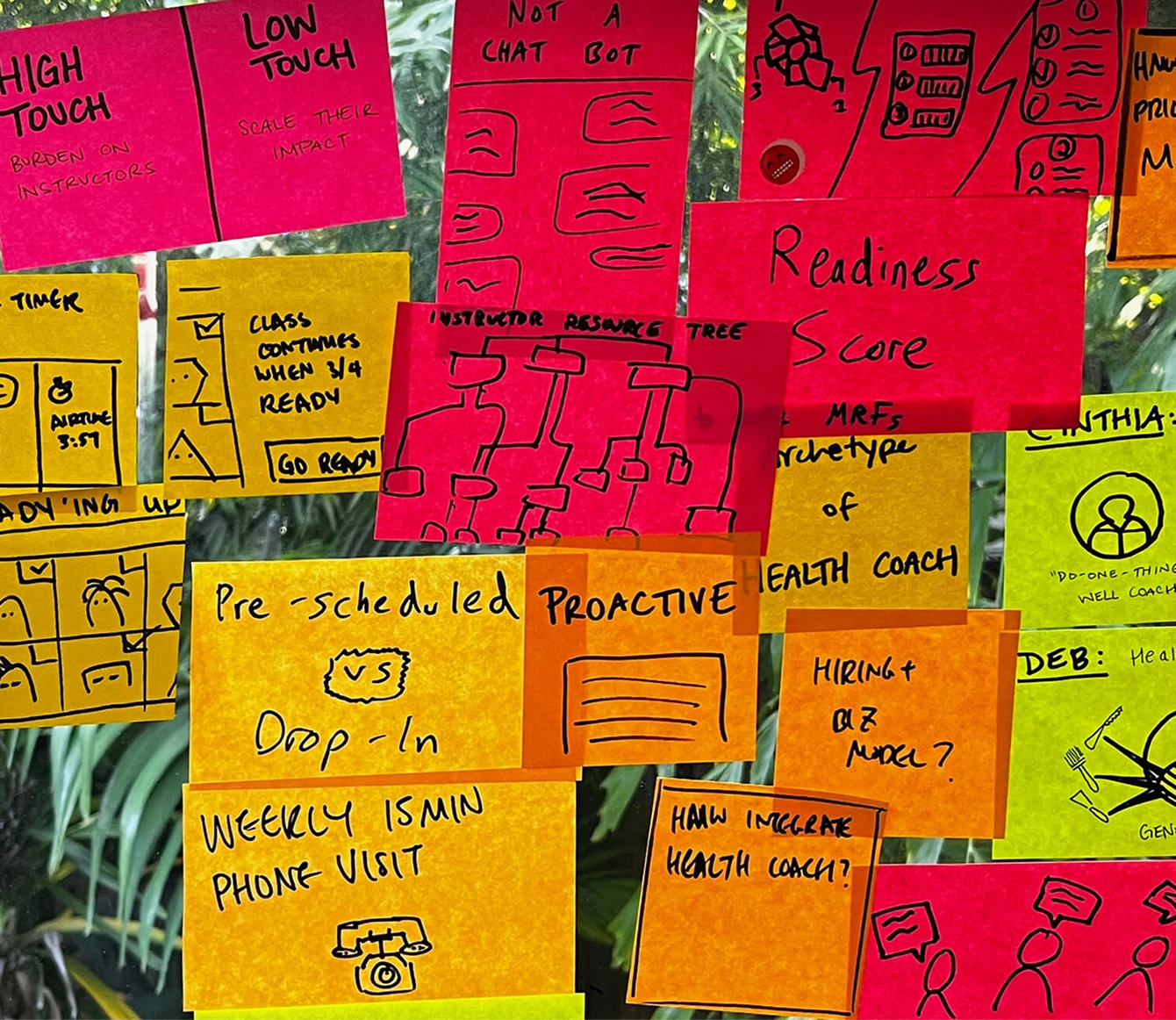
Design thinking is a flexible, iterative process built on seven key components. It draws from the mindset and craft of trained designers, helping teams navigate uncertainty, generate new ideas, and learn by making and testing. It’s not about becoming a designer. It’s about working more creatively and collaboratively.
Where can I learn about design thinking?
Looking for practical tools, courses, and examples? We’ve curated a few trusted places to start, from IDEO and beyond.
“Design thinking is a human-centered approach to innovation that draws from the designer’s toolkit to integrate the needs of people, the possibilities of technology, and the requirements for business success.”
Tim Brown, former IDEO CEO

Want more IDEO in your life?
For updates on our work at IDEO and to stay inspired with our thought leadership content, sign up for our newsletter.
If you want to keep learning and are looking for ways to continue evolving your creative talent, sign up for our IDEO U newsletter, too.